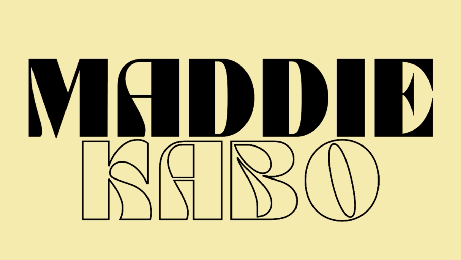
Typographic Composition
September 2024
tools: adobe illustrator
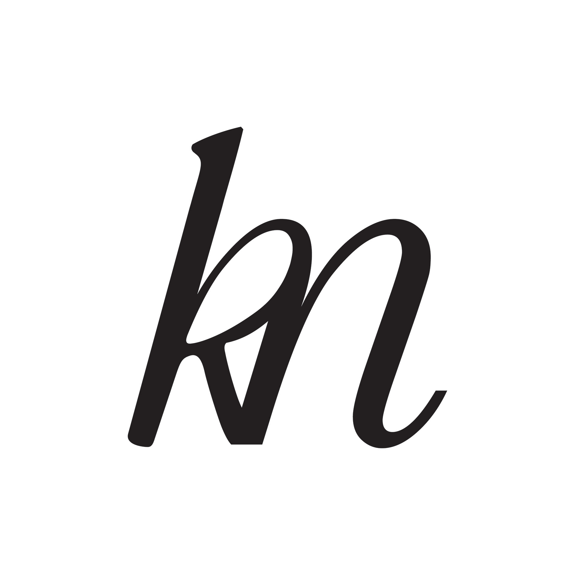
For this project I was tasked with creating a new typographic composition by integrating and manipulating my assigned letters. For my final design, I intentionally chose a font that was more intricate and visually dynamic. I wanted something that stood out from the more conventional font options, so I opted for a swirly, decorative style, which added a unique flair to the composition. The decision to use Garamond Italic for the letter ‘K’ played a significant role in shaping the overall look of the design. Its elegant curves and natural flow offered a visual softness, which contrasted well with other letters in the design, especially the ‘M.’ By using the ‘K’s’ distinctive swirliness, I explored ways to create harmony between the letters. The playful wrapping of the ‘K’ around the ‘M’ allowed me to merge both elements, resulting in a more cohesive and unified design. This process wasn’t immediate—I went through multiple iterations, refining the balance and interaction between the letters until they complemented each other perfectly.
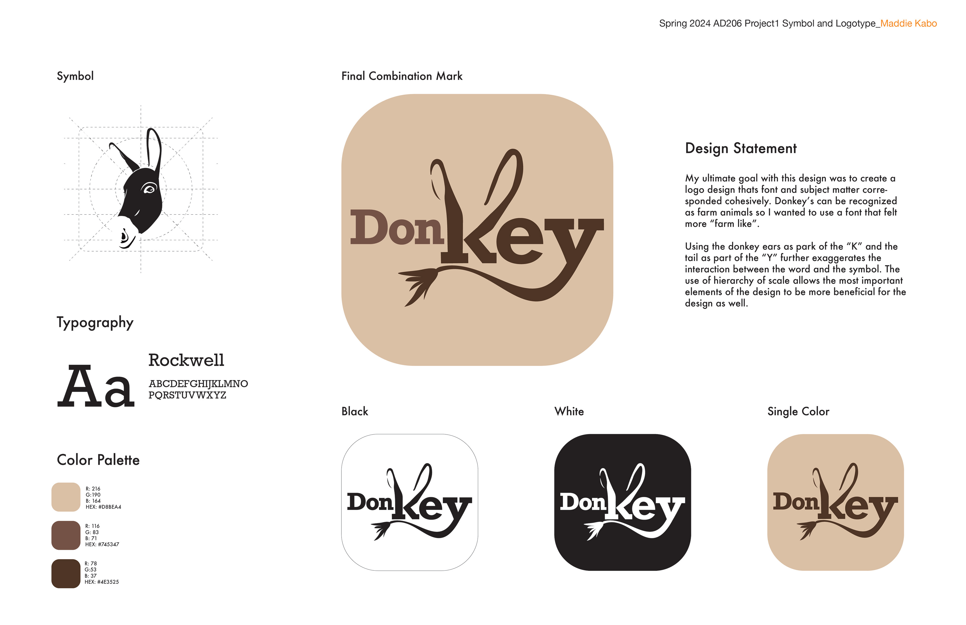
"Donkey" Logo Animaltype
February 2025
tools: Adobe Illustrator
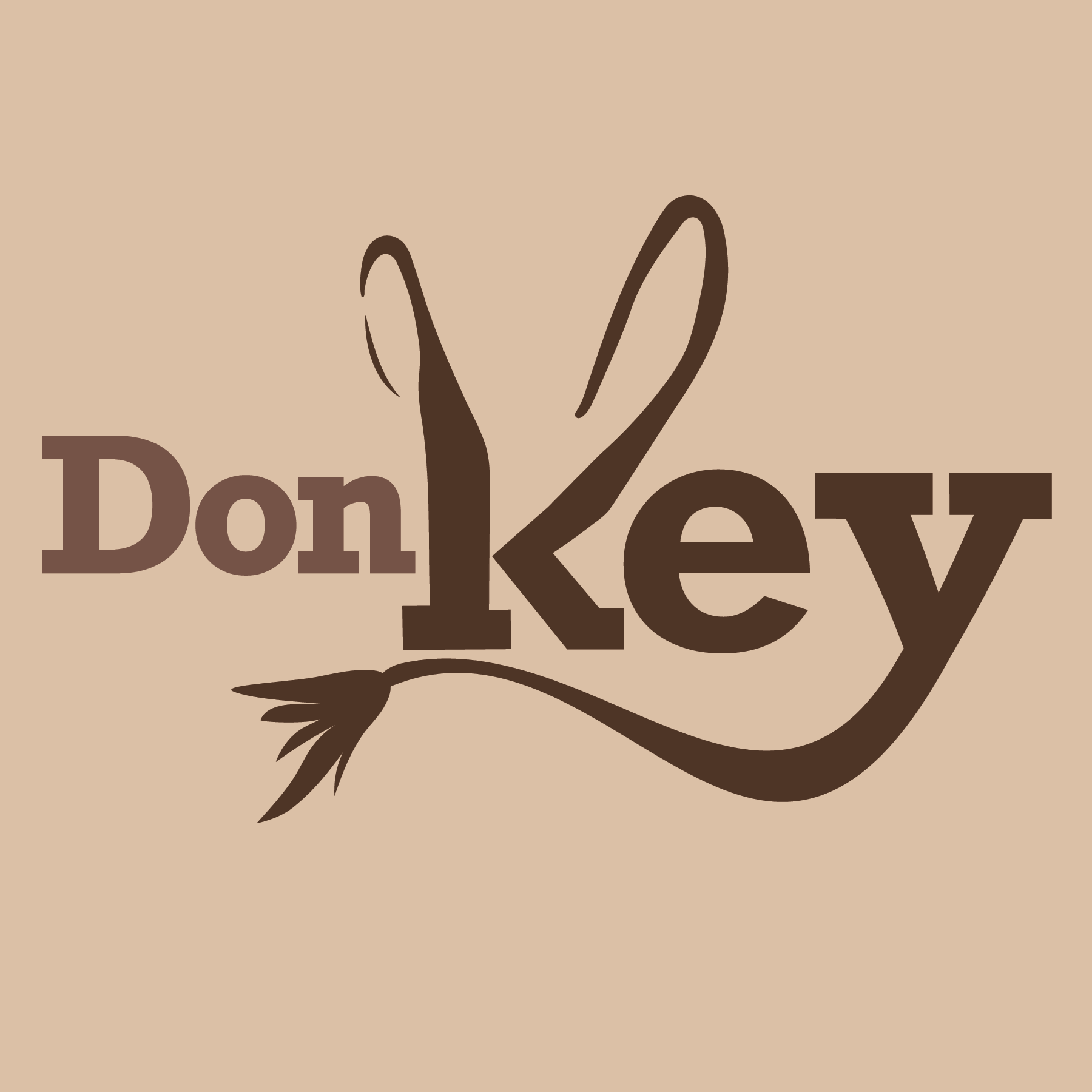
For this project, I was tasked with using the name of my chosen animal, along with elements for that animal, to create an interesting logo composition. My ultimate goal with this design was to create a logo whose font and subject matter cohesively matched. Donkeys can be recognized as farm animals, so I wanted to use a font that felt more “farm-like”. Using the donkey ears as part of the “K” and the tail as part of the “Y” further exaggerates the interaction between the word and the symbol. The use of a hierarchy of scale allows the most important elements of the design to be more beneficial for the design as well